From Visitor to Buyer: How to Optimize Your Mobile E-commerce Sales
Learn how to turn mobile visitors into loyal buyers with proven optimization strategies...
In today's fast-paced digital world, mobile isn't just an option it's the heartbeat of e-commerce. Whether it's a quick scroll on Instagram or a Google search during lunch, your customers are shopping right from their phones. So, how can you turn those casual scrollers into loyal buyers? Let's dive into the strategies that help you boost conversions and maximize mobile sales.
Why Mobile Optimization Matters
Did you know that over 70% of online traffic now comes from mobile devices? Yet, many e-commerce stores still don't offer a seamless mobile experience. A lagging website or cluttered design can instantly push your visitors away sometimes forever. Mobile optimization isn't about shrinking your desktop site; it's about rethinking the shopping journey for smaller screens.
Design for the Thumb, Not the Mouse
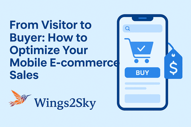
Your user's thumb is your biggest design consideration! Buttons, menus, and call-to-action (CTA) areas should be big enough to tap easily. Avoid crowding and make sure important sections like "Add to Cart" or "Buy Now" are easy to reach.
• Keep your navigation minimal and intuitive
• Use clear, large buttons
• Make checkout steps simple and few
• Optimize product images to load quickly
Speed is the Secret Weapon
Mobile shoppers are impatient and rightly so. A delay of just one second can cost you valuable conversions. Test your site's speed using tools like Google PageSpeed Insights and optimize wherever possible.
• Compress images without losing quality
• Use caching and lazy loading
• Reduce unnecessary scripts and plugins
• Choose a fast, mobile-friendly hosting plan
Simplify the Checkout Process
Imagine adding something to your cart but facing 5 steps before you can finally pay sounds frustrating, right? Simplify your checkout. Every extra click increases the chance of drop-offs.
• Enable guest checkout options
• Use auto-fill for address and payment fields
• Integrate mobile wallets like Google Pay, Apple Pay, and Paytm
• Display trust badges and SSL security seals
Visuals That Convert: High-Quality Imagery
Mobile screens may be small, but they're powerful. High-resolution images and clean visuals grab attention instantly. Let your customers zoom, rotate, and view products from different angles. Add short videos or GIFs to showcase product use in real life it builds trust and boosts engagement.
Personalized Experience = Higher Sales
Personalization can turn casual browsers into long-term customers. Use analytics to understand shopping behavior and tailor recommendations accordingly.
• Show "Recently Viewed" or "Recommended for You" sections
• Offer personalized discounts or push notifications
• Highlight products based on browsing history
Use Data to Drive Smarter Decisions
Analytics isn't just for big brands. Every click, view, and purchase tells a story. Tools like Google Analytics, Hotjar, and Shopify Insights reveal what's working and what's not. Keep track of bounce rates, conversion funnels, and session times then optimize accordingly.
Don't Forget Mobile SEO
Even the best design won't help if your customers can't find you. Make sure your site ranks well on mobile search engines by:
• Using short, keyword-rich titles
• Optimizing meta descriptions for clickability
• Compressing files for faster loading
• Making sure your design passes Google's "Mobile-Friendly Test"
Final Thoughts
Turning a visitor into a buyer is a blend of design, psychology, and data-driven strategy. When your mobile store feels fast, simple, and personal customers stay longer, trust more, and buy faster. Remember, mobile e-commerce isn't just the future it's the now.

